Thursday, April 15, 2010

Explore! Possibilities and Challenges of Mobile Learning


Maria F. Costabile, Antonella De Angeli, Rosa Lanzilotti, Carmelo Ardito, Paolo Buono, Thomas Pederson developed the program Explore! It is a mobile game that is meant to replace the pen and paper format of a game called Gaius' Day. Gaius' Day is a learning game typically played by students at archeological sites in Italy. In the game groups of students are given "missions" that they have to accomplish that end up leading them around the site and teaching them about the history of the site.

Explore! keeps track of all the details of the missions and contains the glossary that they use to look up information about the site. The results of their user study showed that while overall the students enjoyed the mobile app more, they were able to complete their missions much more quickly and accurately when using pen and paper. Part of this is speculated to be because in the mobile app, you have to complete the missions sequentially where as with pencil and paper, the group can strategize and complete the missions in an efficient order.

I find it humorous that the app meant to help this game actually makes it worse and that it is preferred by the users. But if we didn't have "failures" we wouldn't make much progress. I really don't think failure is an appropriate word because it still does contribute knowledge to the field. More specifically, what not to do.

Tuesday, April 13, 2010

Opening Skinner's Box

This was definitely the most interesting book we've read yet. "Open Skinner's Box" is about some of the greatest, and sometimes most disturbing, psychological experiments of the 20th century. Lauren Slater really got into her research for this book. She hunted down old colleagues and family members of the ones who conducted these experiments as well as some of the participants. She even recreated some of the studies to see if she would react the same way as the participants. Many times throughout the book, Slater struck me as crazy herself. Of course then she admitted that she did have mental issues in the past. There you go.

But I did like the way it was written. It didn't feel like a text book. It felt more like a novel. A crazy novel with a few more vivid adjectives than were probably necessary. But still, it was enjoyable.

Inmates Part 2

Yikes! I'm kinda behind! After reading about how much he hates programmers and how horrible they are at design, it was difficult to pick this book up again. At least he was kinder this time around and offered good advice instead of complaining about terrible design the whole time.

Personas are a tool for software design. Basically, you come up with this imaginary person and design the software for them. But it is not simply, "Let's call him John" and that's that. No, you have to come up with their life stories, habits, family, pets, pretty much every thing about them. This helps you understand how someone will use the software and ends up being better for design than creating software for some anonymous person.

Sunday, April 4, 2010

An Interface for Targeted Collection of Common Sense Knowledge Using a Mixture Model


Robert Speer, Jayant Krishnamurthy, Catherine Havasi, Dustin Smith, Henry Lieberman and Kenneth Arnold worked on developing a user interface to help build a "common sense" knowledge database. The main purpose of this interface was to get users to enjoy using this interface so that they are more comfortable and provide better training for the system.


In their system, common sense knowledge is represented as concepts and features. For example "door is part of a house". To build this data base, the team created a "20 Questions" interface. Their hypothesis was that creating a user interface that was interactive and enjoyable would be better at retaining users than a static data entry form. For their user study, they had some users use their 20 Questions system and other users just used a data entry form. They found that those who used 20 Questions were able to complete their task much faster than those who used static data entry. Users also felt that the 20 Questions interface was much more enjoyable and that they felt it adapted itself to their use a lot more.

There are just somethings that are easier done by humans. The problem is that most humans don't want to do these things. Interfaces like this one, interfaces that turn a task into a game, would be very effective at "tricking" people into accomplishing these tasks. As time goes on, I think human computing will more and more become an effective way of generating knowledge.

Saturday, April 3, 2010

Collaborative Translation by Monolinguals with Machine Translators

Daisuke Morita and Toru Ishida of Kyoto University have developed a system to help monolinguals work together using machine translation to create accurate document translation. Machine translation is really useful but is not always accurate. It sometimes produces output with grammatical errors that can cause the receiver to misunderstand the intended message.

In this system, the initial message is translated to the second language. Next the receiver edits the document to correct grammatical errors and clarify ambiguities as he or she thinks is correct. The document is then machine translated back to the sender. Now the sender checks this message to see if the receiver correctly understood the message. If so, they are finished. If the message comes back and the wrong idea is expressed. The original sender will rewrite the message that caused confusion to better convey the correct idea.

This sounds like a good idea but to me it sounds like miscommunication could still occur pretty frequently especially if one party decides to use cultural idioms. I do think it could be of some use though and is probably more accurate than machine translation alone.

Saturday, March 20, 2010

Foldable Interactive Displays


Portability has become very important in electronic devices. It used to be that you could just make a device smaller to make it more portable, but our electronic devices can only get so small. Johnny Chung Lee, Scott E. Hudson and Edward Tse have done research in the area of creating foldable displays.

In this paper, they created four different displays. They were a piece of paper, a scroll, a folding fan and an umbrella. All of these had IR emitters placed on them in places so that they could easily be tracked by a camera and have a screen projected on them. Since the camera they were using could keep track of four IR emitters, by placing them in the right places, the camera could detect if the paper had been folded and adjust the size of the projection. The camera could also use the IR emitters to determine the orientation of the display.


I think this would be good for researching how to create usable foldable displays once the device itself can display the screen instead of needing the screen to be projected onto it. As they are right now, you would need to carry around the camera and projector with you making it not very portable.

Extending 2D Object Arrangement with Pressure-Sensitive Layering Cues

Comment on Jacob's blog

Layers are a very important tool in many graphic design applications. In this paper Philip Davidson and Jefferson Han look for a new way to help users reorder layers and makes use of a multi touch display. The user lifts an image or layer by resting their finger lightly on it. The layer also becomes slightly lightly in color to provide the user with visual feedback. In this mode, the user can move the layer above existing ones. When the user applies more pressure to the object, it darkens to give the impression of being pushed down. When doing this, the user can slide the layer underneath existing layers.


The user can also press on edges of layers. This lowers the edge pushed and raises the opposite edge. This way the layer can be slid on top of or underneath other layers. The user can also push down on some layers while lifting others in order to rearrange them. If the user wants to place a layer between stacked layers, the user can use their finger to peel the layers back as though it were a stack of papers and place the new layer in the middle of the stack.

I would love to try this out. I use layers extensively when I am drawing on my computer. I would love to use this to see if it makes reordering the layers any easier. Not that it is difficult now, it could just be faster.

Friday, March 19, 2010

Annotating Gigapixel Images

Comment on Jill's Blog

Gigapixel images are huge. Really huge. They consist of billions of pixels. The upside is that they can capture an insane amount of detail. The downside is that not nearly all of it is visible at once. Annotations are a useful way to provide the viewer with extra information about the image, but how do you make annotations on a massive image in such a way that they are easily readable and don't completely clutter up the screen when you zoom out? This is the issue tackled in this paper by Quing Luan, Steven Drucker, Johannes Kopf, Ying-Qing Xu and Michael Cohen.


Annotations can be put over any sized area of the image. The annotation also has a "depth." At the user zooms in on the image, it appears to the user that they are getting closer to whatever they are zooming in on. The annotations also get larger as the user zooms in. However once the user goes past the "depth" of the annotation, it is no longer displayed. Many annotations have an upper cap on them. That is, they do not appear until the user has zoomed in sufficiently close.

I feel that this is pretty similar to what Google Earth does already. However, I believe this works in real time and and Google Earth doesn't use gigapixel images. I've never worked with gigapixel images but I can see how this would be useful.

ILoveSketch: As-Natural-As-Possible Sketching System for Creating 3D Curve Models

Comment on Jill's Blog

Seok-Hyung Bae, Ravin Balakrishnan and Karan Singh from the Department of Computer Science at the University of Toronto are the minds behind ILoveSketch. Their purpose was to develop a 3D sketching system that captures the affordances of pen and paper to make things easier for designers. They created several features that aid the designer both in 2D and 3D.

One of the 2D features is an aid for drawing 2D curves. When drawing a curve, designers will usually make several light strokes and darken them as they approach the desired curve. ILoveSketch looks at these multiple strokes and after a certain time out period, will draw a NURBS curve that best fits the strokes. This helps the designer easily create smooth curves. This technique can also be used to join multiple curves by making strokes that connect them. Another 2D feature is the automatic rotation of the paper based on the angle or curve of the marks made. The goal is to rotate the paper into a more comfortable position for the designer. However, in the user study, the automatic rotation was noted as an undesirable feature.

Some of the 3D features were familiar because they were improved in the follow up work that I already did a post on called "EverybodyLovesSketch." Sketch planes were indicated by using the axis widget. By making a gesture across two axes, the sketch plane would be the plane that contained both of those axes. By making a flick across one axis makes the sketch plane on that axis and parallel to the flick mark. One can also indicate an arbitrary sketch plane by making a flick from the origin of the axis widget to any direction.


I am glad I read this paper since I have already read the paper that expands on this. The other paper comes up with more and better ways to indicate sketch planes. It was cool to see where EverybodyLovesSketch came from. I thought the coolest feature was making the NURBS curve from multiple strokes. I feel it would be very useful for designers.

Thursday, March 4, 2010

Data-Driven Exploration of Musical Chord Sequences

Comment on Gus's Blog

Eric Nichols, Dan Morris and Sumit Basu developed a tool that allows people who are making music to easily build harmonies on their music. By using lots of sample data, they are easily able to take a melody and generate several pleasing chord progressions that fit with the melody. This tool allows the user to explore and easily and quickly build harmonies in their music. From the input data, a widget is generated with several sliders, each one representing a different artist or genre of music. Buy adjusting these sliders, the user can change the type or style of chords that are generated. The users in the user study found this tool to be very useful and fun. Some of the users though did express that they would like the ability to manually change specific measures and the frequency of chord changes.

I think this has potential to be a good music writing tool. I would also like to see extra features added like the ones some of the users specified. I'd love to toy with it for a while and see what I could come up with.

Multi-touch Interaction for Robot Control

Comment on Ross's Blog

Mark Micire, Jill Drury, Brenden Keyes and Holly Yanco explored how people would interact with and use a multi-touch interface to control a robot. Some of the items on the control display include forward and backward cameras, top down and isometric maps of the area being navigated, four directional control buttons, a brake button and a button for the lights. The user study performed was to see how the users interacted with the multi touch controller. They were surprised to find that all of the users handled and interacted with the controls in very different ways.

I thought this was pretty neat. Although I think it would be better if there was some kind of tactile feed back from the controls. From this study, a lot could be gleaned about how people perceive the affordance of controllers.

Monday, March 1, 2010

Emotional Design

Donald Norman has definitely taken a different direction with this book than he did in "The Design of Everyday Things." In TDOET, good design was everything. A user should be able to know how to use a device or object quickly without having to think about it. Nothing was more important than good design. Now, it seems as though there is something just a little more important than design. People have to like the things that they use.

Something could be very poorly designed, however, it may be that people enjoy using it. If someone enjoys using something, they are more inclined to use it again and again and even might convince their friends to buy the product as well. People will buy and use products that are poorly designed if the product is fun and enjoyable to use. Norman goes into great detail about the levels of human thinking including the visceral (instinctive) level, the reflective level and the behavioral level.

He also talks about how affective computing (emulating emotion in computing) could help us design devices that interact with people better. This is because of how important emotions are to humans understanding one another. There is so much information you can glean from a conversation just by listening to the tone of voice and observing facial cues and body posture. If our machines could interpret and communicate emotions in the same way humans do, they would be better equipped to handle their tasks and they would be easier for humans to interact with. In the last chapter, Norman discusses some concerns about issues that could be raised in the future as affective computing becomes more advanced and more integrated into our every day lives.

I thought it was a very interesting read. Certainly different from his last work that we read. He took a very different direction this time going from pure design to "make it enjoyable to use". The last chapter also felt very different from the rest of the book. I guess because he saves all the cautions and thoughts about repercussions of affective computing for the ending. And now, the search for what is more important than emotional design!

Thursday, February 25, 2010

Simplified Facial Animation Control Utilizing Novel Input Devices

Comment on this blog.

In this project, Nikolaus Bee, Bernhard Falk and Elisabeth Andre at the University of Augsburg were experimenting with new types of imput devices for facial animation. One of the more traditional controls for facial animation are sliders. However with sliders, the user can only manipulate one feature at a time. This study looks at using an xbox 360 controller and a data glove as new forms of control.

For the xbox 360 controller, the user uses the directional pad to control which portion of the face he or she is controlling: upper, middle or lower. Then the analog sticks and the trigger buttons are used to control different features on that part of the face. The data glove mapped facial movements to the fingers and different areas of the face could be selected using the buttons on the data glove. The user study showed that users were able to work much more quickly were much more comfortable using the xbox 360 controller than the data glove or traditional sliders.


I would love to try this out. I've always been into modeling and animation. This sounds like an easy and quick way to make the poses you want. I didn't really like the idea of using the data glove to control the face though. That just sounds as though it would be difficult to control and get the hang of.

Learning to Generalize for Complex Selection Tasks

Comment on Ross's blog.

Have you ever been going through a folder on your computer trying to select only certain files. It can be really frustrating and tedious. One misstep can deselect all of your carefully made selections. Alan Ritter from the University of Washington and Sumit Basu from Microsoft Research have been looking for a way to make complex selection easier.


The first component of their selection tool is the selection classifier. This component looks for features common to the selections the users are making and weights them. Some example features include:
  • The presence of any substrings of length 3 or greater in the files' names
  • The value of the file extension
  • the file creation date being greater or less than/equal to each of the file creation dates of the current selections
  • the file size being greater or less than/equal to each of the file sizes of the current selections.
Next the regressor tries to generalize the users selections so that it can accurately predict what other files the user is going to select. Some of the features that the regressor looked at for item i were:

  • The number of times the user (de)selected an item while i was (de)selected
  • Whether the last example provided by the user last changed the selection state in the same round as i
  • The proximity of i to the last example provided by the user.
  • and more
For the user study, participants were asked to select certain groups of files using regular selection and their new auto selection tool. The tool was found to be highly accurate and many of the users said that they enjoyed it.

I would love to have this feature on my computer. This would make reorganizing files on my computer a lot easier and quicker. My only fear is that it might auto select items that I want to keep when I am selecting things I want to delete. I would be really paranoid about this and probably double and triple check.

Wednesday, February 17, 2010

"Pimp My Roomba": Designing for Personalization

Comment on Brandon's blog

This study done by JaYoung Sung, Rebecca Grinter and Henrick Christensen was aimed to see if people could be influenced to personalize their roomba and if so, does that have any effect on how they view their roomba. Thirty different households were each given a roomba and half of those recieved a personalization tool kit. Ten of the house holds that recieved a tool kit either ordered skins for the roombas or used stickers and letter sets. However, not everyone who ordered a skin used it.

The people that did decorate their roombas did seem to have a greater personal attachment to it. Some of them had names and were treated almost as a pet would be treated. One participant was quoted as saying that it felt, "more like our Roomba instead of a Roomba." Some of the participants who personalized their roombas felt as though their roomba did a better job. Some of the reasons given for why people did not personalize their roomba were that they didn't have time, didn't see or feel a need or could not find any decorations they like.

I thought it was very interesting just how attached some of the people became to their roombas. I know I'm pretty attached to my iPod and computer. I tend to personify them and act as though they have personalities. For example, when my computer is acting up and not behaving as it should, I say that it is angry or upset with me.

My Dating Site Thinks I'm a Loser

Comment on Jill's blog,

This study was carried out by Shailendra Rao, Tom Hurlbutt, Clifford Nass and Nundu JanakiRam from Stanford university. In this study, they wanted to see if the presence of one's own personal photo and/or the presentation intervals between recommendations on a dating site would affect the user's behavior. They began by taking 56 participants and having them set up a profile on MetaMatch, a dating website created by the researchers. The users were then required to answer questions that would be used to find their matches.

Regardless of how the participants answered the question, they were given a set of four poor matches. Half of the participants were made to answer all the questions before seeing their matches and the others saw a set of four matches after every ten questions. Of the people that received several sets of matches, some of them had their own photo present on the page when they answered the next set of questions and some did not.

The researchers found that people were much more inclined to change the way they answered the questions when they received undesirable matches and their photo was not present on the screen. I guess if you picture is there, you feel like you are lying to yourself. Of course, if you don't answer the questions truthfully, you are. They also found that the participants who received several sets of bad matches became much more frustrated than those who only received one set.

I think that this could definitely be used to find ways of improving, not just dating recommendations but different types of recommendations on other websites. However, I think that dating sites are just much more difficult just because of how personal they are. Recommendations for books are great because if I buy the book and don't like it, that's fine. On a dating site though, there is much more at stake emotionally.

Monday, February 15, 2010

Inmates are running the asylum

As I was reading this book, my first impression of Alan Cooper was that he was a jerk. He spends so much time saying how awful programmers are. As read on though, I had to agree with him, though I still thought he could have been more tactful. But sometimes you have to be loud to get someones attention. His main point is that programmers build products for programmers. Programmers design programs without taking the common user into account. This results in a system that is easy for the programmer to use (because he built it) and difficult for the user to use. Cooper believes that anyone should be able to use a piece of software with little to preferably no training. The fact that so many users feel they can't use a computer is the fault of poor design on the programmer's part and not the user's ineptitude.


Probably my favorite part of this section was toward the end of chapter 7 when he compares programmers to jocks. He says that while the jocks find a lesson in humility when they go out into the world and find that physical bullying doesn't work anymore, there is no such lesson for intellectual bullies. I've seen some of these intellectual bullies in some of my CS classes. When going over a difficult topic in some classes, there is the one person who understands and rather than help the other student's understand, they look down on their classmates and loudly proclaim that anyone who doesn't understand must be an idiot. This prevents the people who don't understand from asking questions leaving them in a confused state.


I think this attitude carries over into the professional world when programmers don't understand why users don't understand how to use their program. "It's just a simple keyboard shortcut!" Yeah, one that you came up with and told no one about. Programmers need to realize the importance of good design. They also need to realize that they have studied this field a lot more than most people. Users aren't stupid (most of them), programmers have just had more training. And that is my soap box I found while reading this book.

Wednesday, February 10, 2010

Fast Gaze Typing with an Adjustable Dwell Time

Comment on Aaron's blog.

Paivi Majaranta, Ulla-Kaija Ahola and Oleg Spakov were trying to find a way to increase the typing speed of those that use gaze typing. Gaze typing is a form of text entry where the user's eyes are tracked and registers a keystroke when they stare at a key for a predetermined amount of time. Because of this register time, this limits the typing speed of the users to 5-10 words per minute.


For their system, they allowed the user to adjust the gaze time required to register a stroke. They found that within one or two days, many of the participants were able to greatly reduce the gaze time and still maintain high accuracy in their typing. In this study, the grand mean of the typing speed went from 6.9 wpm to 19.89 wpm with little significant reduction in accuracy.


I think that for something like gaze typing, an adjustable dwell time is very important. The more the user uses it, the more proficient he or she will become. By allowing the user to adjust the dwell time, the user's ability is not limited by the hardware. This allows the user to function more efficiently.

The VoiceBot: A Voice Controlled Robot Arm

Comment on Daniel's blog


In this paper, Brandi House, Jonathan Malkin and Jeff Bilmes look at modifying the vocal joy stick in such a way that it can be used to control a robot arm. They first built a 2d model and then extended to to the 3d robotic arm. They tested the robotic arm with multiple control schemes including forward kinematic, where each joint is controlled separately, and inverse kinematic, where the user directly controls the end furthest from the base and the other joints are positioned using an inverse kinematic solver.


The robot arm was controlled by the user making various vowel sounds at varying pitches and volumes. For the tests, fore each control scheme several users were given instructions and was allowed up to ten minutes to practice. They were then given the task of using the robot arm to pick up two pieces of candy and place them in a target area. It was found that the users favored and worked better with the inverse kinematic control scheme as opposed to the forward kinematic controls.


I do think that this could be usefull for disabled people. I also think it could be interesting to watch some one use this. It would kind of sound like they are singing. Also, we already have several other forms of controll for the handicapped like gazing and brain sensors.

Sunday, February 7, 2010

Sacred Imagery in Techno-Spiritual Design

Comment on Nate's post.

With technology making its way into every aspect of our lives, it is important to consider how we design for those areas. For many people, religion is a large and important part of their lives. Many people hang religious images in their households to remind them of the principles and rules of their religion. Susan P. Wyche, Kelly E. Caine, Benjamin K. Davison, Shwetak N. Patel,
Michael Arteaga, and Rebecca E. Grinter did a study on integrating religious images into applications that have a religious purpose.


The group experimented using a mobile application that showed Muslims when it was time to pray. They incorporated a lot of imagery that is important in Islamic culture: Nature, Light, Mosques, the color green. A user study showed that the Muslim users of this program found that the imagery helped them to be more focused on the important aspects of their religion.

Being religious my self, I know that Christian symbols sometimes help me focus my life more. I would like to see ways that sacred imagery could be used in applications for other religions as well. Of course it would be very important to research imagery of which ever religion you are designing for. This could also be applied to secular applications. One could research what symbols evoke certain thoughts in the user.

Saturday, February 6, 2010

Simulated Augmented Reality Windshield Display as a Cognitive Mapping Aid for Elder Driver Navigation

Comment on Jacob's blog

In this paper, Seung Jun Kim and Anind K. Dey are developing an augmented reality windshield display that will aid in navigation and reduce distractions and cognitive load for the user. Many elderly drivers find it difficult to focus on the road and use a GPS device at the same time. This windshield would superimpose a map on the windshield that came down to meet the road. This would hopefully make it easier for the elderly to navigate in the car and to reduce the amount of required eye movement.

In their experiments, Kim and Dey created a driving simulation that gave the user a route to follow that included several turns, traffic signals, stop signs and pedestrians. The user would complete one route using a standard GPS device and then complete a different route using the AR display. The study was conducted with both elderly (>65) and younger (19-41) drivers. They also used a gaze tracker to track eye movement. In the experiment, the participants were far less likely to miss turns or violate traffic laws when using the AR simulation as opposed to the standard GPS. It was also discovered that there was far less eye movement and distraction.


I would love to have this kind of display in my car. I don't have GPS so when I am traveling somewhere new, I print out a map. This can be difficult because I don't always know my exact position on the map and trying to read the directions while driving. This would make navigation so much easier and safer. I would like to see this implemented in an actual car and see if in a similar study, the same results are found. However, like Kim says in the paper, this just cant be done very well yet.

Designing for the Self: Making Products that Help People Become the Person they Desire to Be

Comment on Patrick's blog.

In this paper, John Zimmerman designed six objects for use in the lives of everyday parents to help them become the parents they want to be. Through this, he hopes to discover how product attachment theory can be applied to design. This way, it would become easier to design products that people not only are comfortable using, but enjoy using.

Zimmerman created the following products for the study:
  • a simple clock that uses a moon and a sun to tell children when they are supposed to stay in bed and when they can get up
  • a digital picture frame that adjusts the pictures shown based on who is present
  • a sports bag that notifies children if they don't have all the equipment they need for that day
  • a calendar that keeps track of a child's medication and medical history
  • a simple interface called Magonote through which anyone, including children, can operate several networked household devices.
  • and a mobile zen application designed to keep Buddhists connected to their community

Zimmerman was then able to come up with six categories linked to product attachment: role engagement, control, affiliation, ability vs bad habit, long term goals and ritual. An example of role engagement/ritual is that the clock requires that the parent set it each night so that it becomes integrated into the goodnight routine and helps the parent focus on this one thing. This is analogous to the ritual bedtime story. Many parents develop an attachment to the bedtime stories they read their children. An example of ability vs bad habit would be the calendar. It helps the parent remain on top of things which presents a good image to their child.

To be honest, I'm not entirely sure what Zimmerman accomplished other than creating useful household items. Most of his explanation of how he believes the devices would fit into the six categories. He didn't seem to mention any experiments about these products though. I would like to see a user study done with these products to see if the owners really do become attached to these products.

Friday, February 5, 2010

Eyespy: Supporting Navigation through Play

Comment on Bill's blog.

Eyespy is an interesting program built by Marek Bell, Stuart Reeves, Barry Brown, Scott Sherwood, Donny McMillan, John Ferguson and Matthew Chalmers that uses a game to get humans to build a database of pictures that are useful for navigating an area. How is this accomplished? The game it self is divided into two parts. First, the player goes around (literally anywhere) and creates photo or text tags in places for other players to find. However, these need to be easily identifiable since when another player 'confirms' your tag, you get extra points. The second part of the game is to find tags created by other players. Each day you are sent five photo tags and five text tags. By finding these you and the player that created the tag earn points.

The tag and confirm portions must be done in approximately the same locations. For example, if I recognize where a picture was taken, I can't just confirm it from my house (unless the picture was taken at my house). I have to go to the place where the picture was taken. The way this works is that the phone you are playing on detects the nearby wireless networks to determine your location.

The makers of Eyespy then conducted a user study with images captured from Eyespy and images pulled from Flickr. Two routes were created through a large public area and users used photos pulled from either Eyespy or Flickr exclusively to try and find their way through the route. The users that used the Eyespy tags were able to identify the locations on the route much faster and with much greater accuracy than those that used the Flickr tags. This could be used to help aid tourists in navigating unfamiliar areas.

I think this is a great way to improve location tags on images, especially if the Eyespy becomes more widespread. It is a very reliable way for getting identifiable images since the ones that are most identifiable will most likely get the highest scores. And the incentive of high scores encourages players to try and snap easily identifiable pictures. I would love to see if this 'human algorithm' (as the authors call it) could be applied to other areas of computer science.

Monday, February 1, 2010

Ethnography Project

Brandon Jarratt and I both work at jobs were we are constantly bombarded with questions about computers (Help Desk Central and the SCC respectively). We are interested in keeping track of what type of people ask us what questions to see if certain demographics have more computer trouble than others.

Do certain demographics struggle more with wireless internet? Is the type of machine or OS linked to the type of people who have more trouble than others? These are just a few questions that we may be able to answer with this study.

The Design of Everyday Things

The Design of Everyday things is basically a book all about making sure that simple objects should be simple to use. The author goes through several stories about people he has seen or talked to that have had trouble opening doors, operating VCR's and other devices that people frequently use. He states that there needs to be clues or signals or signs on these everyday devices so that a user has to spend very little, if any, time trying to figure out how to use the device. Often, a designer will design an object or device with only aesthetics in mind and doesn't consider the usability of the object. You can make a door as beautiful and elegant as you want, but if no one can figure out how to open it, what is the point? However, if you are designing a door that is meant to be hidden, it's probably a good thing if the average person cannot figure out how to open it.

Ever since I read this book, I've taken a notice to how usable (or unusable) things can be. The other day, one of my professors spent over five minutes looking for the switch for the projector screen. One would thing that it would be on the wall near the projection screen or on the podium next to the computer terminal, but it wasn't. Also, I used Internet Explorer the other day, because there were no other browsers installed on the computer, and I noticed that some of the tabbed web pages at the top were different colors. I found this feature annoying so I right clicked on the tabs and then clicked "Ungroup Tabs".

How did I know to do this? I had never seen this feature before. I easily noticed that whenever I had multicolored tabs, there were always at least two that were the same color. I then realized that all the tabs of the same color were links from the original page that I had opened in new tabs and could be "grouped" according to that. I was able to figure all that out in very little time and without really thinking about it. That is good design.

Ever since reading "The Design of Everyday Things", little things like that now stick out to me and I believe that I will be more concious of how a user would interact with interfaces I design as a result.

Sunday, January 24, 2010

SemFeel: A User Interface with Semantic Tactile Feedback for Mobile Touch-screen Devices

Comments posted on Jill's Blog and Chris's blog.

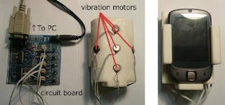
Touch screens are present on most new mobile devices. While they are good and useful, you must be looking at the screen to know if you have touched the right button. Recently, makers of mobile devices have been experimenting with vibration to inform a user when he or she is pressing a button on the screen. In their paper, Koji Yatani and Khai Truong experiment with using multiple vibrating actuators in a mobile device to inform the user of which button he or she is pressing.


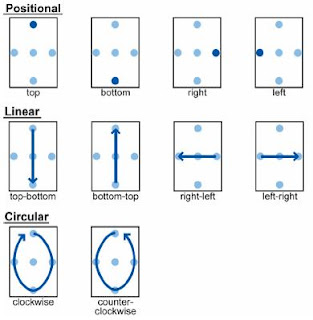
SemFeel is a sleeve developed to fit on a mobile device that has five vibrating actuators. One in the middle, top, bottom, left and right. Using these actuators, eleven different patterns of vibration were able to be produced. One at each of the actuators, one going left to right and vice versa, one going up to down and vice versa, one going clockwise and another going counterclockwise. Experiments with each of these patterns showed that users were easily able to recognize all of the patterns except for counterclockwise.


One of the tests required users to enter four digit numbers on the mobile device without looking at the screen of the mobile device. Testers that used SemFeel completed the tests far more accurately than those that used a mobile device with only one or no vibrating actuators.

I think that this device would be very useful. Even when I use my Ipod, I always press the wrong button when I don't look at my screen. A device like this would help me know whether or not I'm pressing the right button. I don't like the fact that you have to put this large sleeve on the device to get it to work. I would try to find a way to integrate the SemFeel system into the device itself.

Saturday, January 23, 2010

Disappearing Mobile Devices

Mobile devices are getting smaller all the time. With this comes a growing problem. Peoples hands stay the same size and are too big for people to use the tiny interfaces. In this paper, Tao Ni and Patrick Baudisch look for ways to interface with very small mobile devices. They first decided that a gesture recognition system would work best. To record the gestures, motion scanners, touch scanners and direction scanners were used. Some of the problems that occurred when trying to implement the gesture system were that sometimes a person's finger was too small and caused errors when the sensor no longer detected the person's finger. To compensate for this, the user used their entire hand instead of just a finger to make gestures.


They decided to test the system using two different unistroke input systems, Graffiti and EdgeWrite. The participants in the test were able to use the EdgeWrite system using this interface with much fewer errors than with the Graffiti system. By the end of the study, they had come up with a list of design implications for a disappearing mobile device, including:

  • Use the entire hand for input to allow for larger motion amplitude. It reduces error with complex gestures.
  • Preferably use unistroke gestures that do not rely on the correct recognition of relative position features. (This is what caused many of the errors for users using Graffiti.)
  • Design devices, such that they glance over irregularities and gaps between fingers. However, limit the focal range to prevent motion past lift-off from being recognized as a gesture.


While I thought it was a cool idea, I think it would be very difficult to use. I would struggle to remember the gestures. Also, they have not developed anything to give the user any visual feedback. The user doesn't know if the gesture they made is correct or not. I would try to fix that problem if I were to continue work on this project.

Wednesday, January 20, 2010

Pressure Sensitive Keyboards

Comments on Jill's blog and Brandon's blog

We all use keyboards just about everyday. In fact, I'm even using one now! Over the many years we've used them though, they have kept the same functionality. To type and the occasional keyboard shortcut. This paper discusses making a keyboard with pressure sensitive keys. Instead of having simple contact points underneath the keys like most keyboards, this keyboard uses small domes that are able to detect how much surface area is touching. The harder the keys are pressed, the more surface area is touching.


In gaming this could be used to tell the player's character how fast to run depending on how hard the key is pressed. When typing, pressing the keys harder could increase the size of the font. It could also be used to detect accidental key strokes by filtering out keystrokes that are significantly softer than the rest.

I thought the concept was pretty cool and I won't deny that it definitely has applications. I just don't see this feature catching on very quickly. I might use the feature that changes the font size in a chat application. If I were to work on this project, I would probably try and find some additional and more useful applications for the keyboard.

Tuesday, January 19, 2010

3D Sketching


EverybodyLovesSketch is an intuitive program that allows the user to create 3D models and sketches using concepts from perspective drawing. Artist and designers have several techniques that help them draw things properly in a perspective view. (Vanishing points, perspective grids etc.) These things help artist visualize planes in a 3D space on a 2D surface. EverybodyLovesSketch allows the user to specify, select and draw directly onto these planes in order to draw 3D curves using 2D techniques. (Like drawing on a graphics tablet).
By making a small tick mark on a curve, a horizontal sketch plane is created at the level in space of that curve. By making two tick marks across curves a vertical plane is created that goes through both tick marks. Three tick marks are used to create an arbitrary plane. By selecting one or more curves and using flicking gestures, the user can create orthographic sketch planes or orthographic extruded sketch planes. Users can also select one or more curves, copy them and then project them onto a different sketch plane. Users can also select multiple curves that form a closed loop and create a surface from those curves. Then the user can draw curves on that surface.

A study was conducted to see just how intuitive the program was. 49 high schoolers were taught how to use the program and worked with the program for 75 minutes a day for 11 days. In most cases, students were able to create decent 3D sketches in the first 3 or 4 days. Many students began with an actual 2D sketch and then translated it to 3D using the program.

Having taken drawing classes, I am familiar with techniques used in perspective drawing. I found this paper to be really fascinating. This program uses the ways that artists create the illusion of 3D space to create something that is actually in a 3D space. Another beautiful blend of art and technology. If I were to add a feature to this program, I would probably add a texture and shader brush that allows you to draw on the surface of your sketches. The program already is able create surfaces between the curves and draw on them.

Link to the paper